Center of the American Experiment
At a Glance

About the Project

american-experiment-home
american-experiment-archive
american-experiment-about-page
american-experiment-bio-page
american-experiment-post

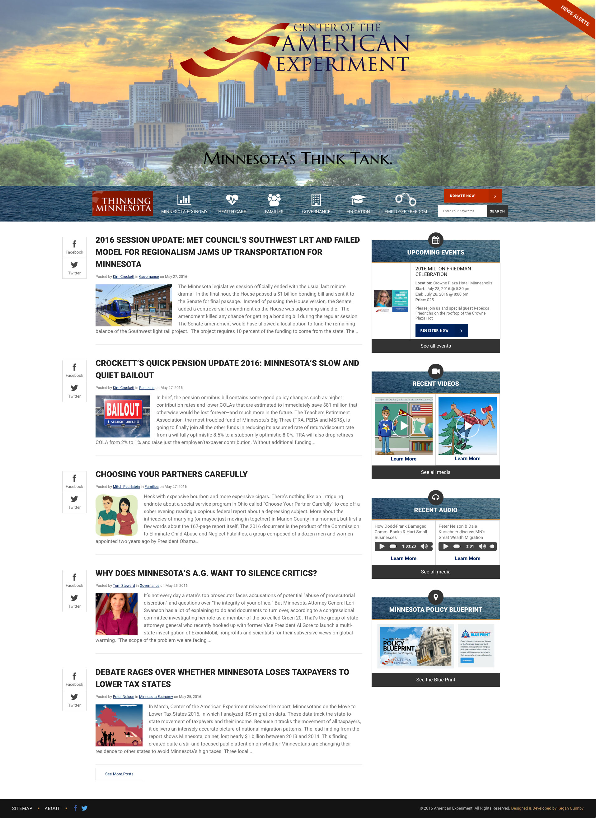
The Center of the American Experiment is a think tank based in Minnesota. They report on a variety of issues and topics, and have multiple authors contributing almost daily.
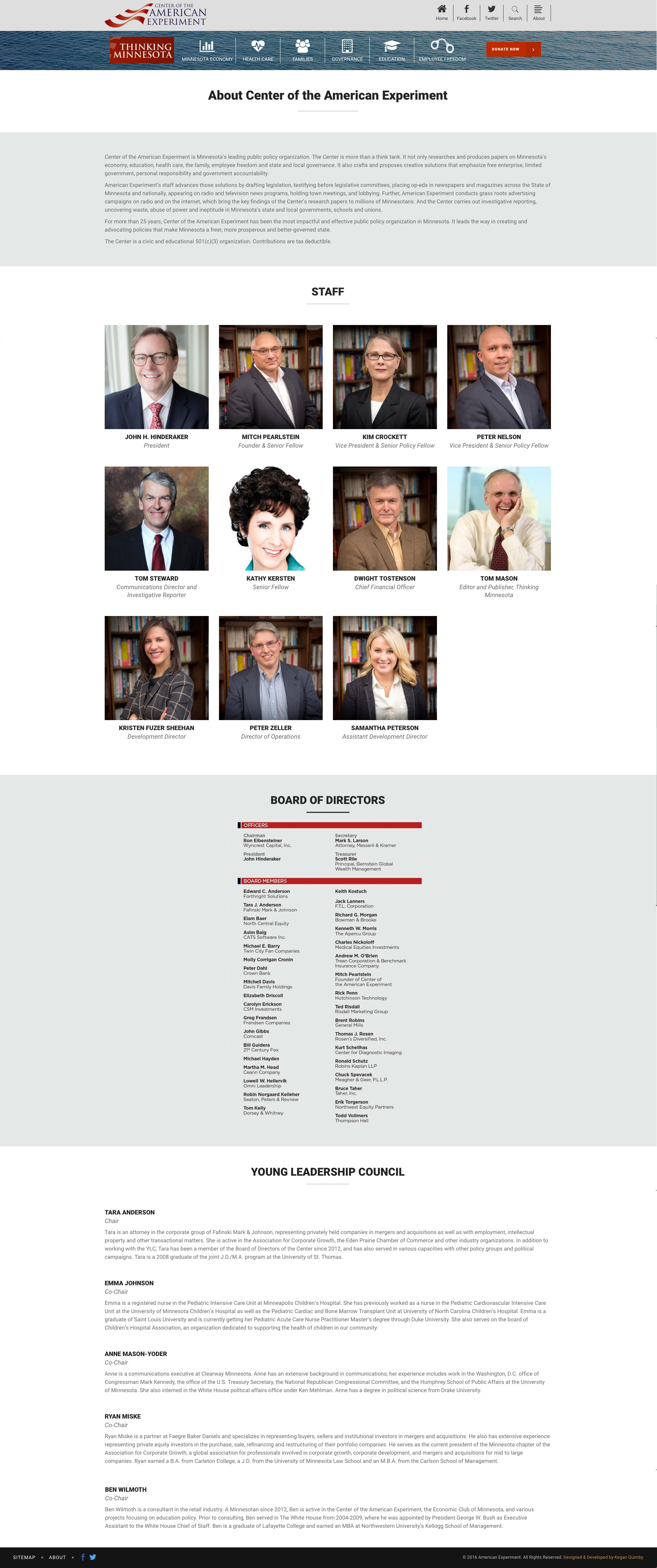
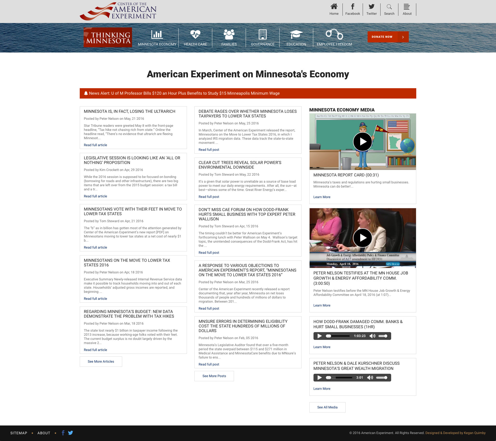
They had a Drupal site from a few years ago with all their content organized by type of post (IE books, videos, events, alerts, etc.) as opposed to a category. We changed the hierarchy of their site so everything is organized into one of six categories. Hopefully what we see is more recurring visitors interested in a single (or many) topic.

Whereas the old site it was hard to find information on any given topic without doing some kind of search (which people rarely do), now visitors can click into the topics that matter most to them and find all the different content associated with that topic: events being held, reports that were published, blog posts on the topic, etc.

From a design stand point restructuring their content in this manner needed to account for a lot more pages: archive pages, single posts, events, the home page obviously, etc. etc. No longer would every single piece of content be shown in the same manner. After making the assumption that users would be most interested in a single category (economy, education, etc.) setting up archive pages was rather straight forward: show anything tagged with that category. So we set up a few columns with the main stuff from the category and displayed other things (such as news alerts) in a more subtle matter.

From a technical stand point, everything was set up in WordPress with custom post types. This allowed us to have a very easy 1-to-1 ratio from the old site to the new site. Then we just pulled from the post types that we needed, where we needed them via page templates in WordPress.

Once all the content was showing in the right place, getting the rest to click was quite simple: fixing things for phones and tablets, utilizing a drag and drop editor for some inner pages, and a few other smaller things.

Now, the Center of the American Experiment has a much cleaner, easier to browse site that is mobile and tablet friendly!
american-experiment-home
american-experiment-archive
american-experiment-about-page
american-experiment-bio-page
american-experiment-post

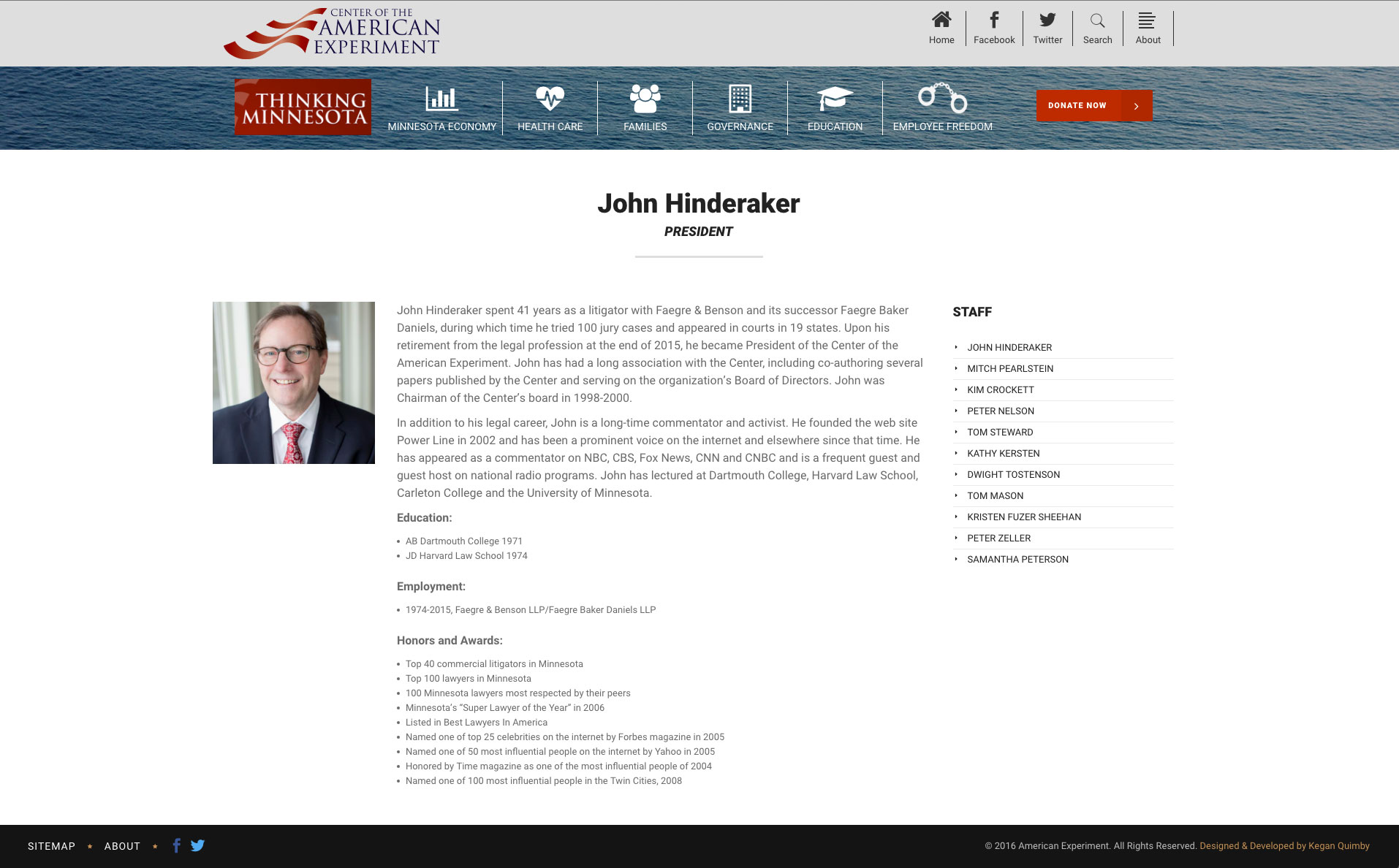
The Center of the American Experiment is a think tank based in Minnesota. They report on a variety of issues and topics, and have multiple authors contributing almost daily.
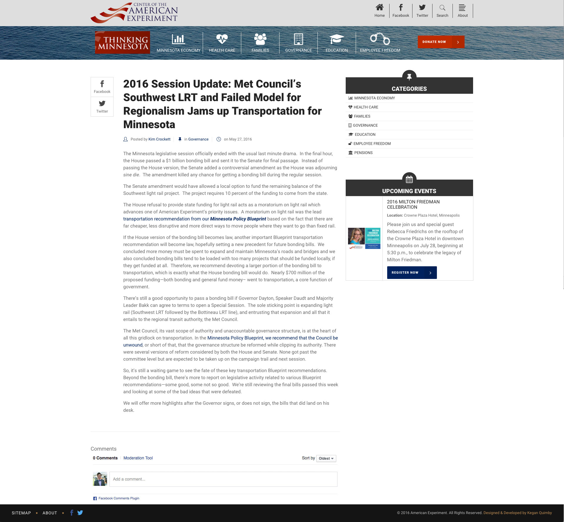
They had a Drupal site from a few years ago with all their content organized by type of post (IE books, videos, events, alerts, etc.) as opposed to a category. We changed the hierarchy of their site so everything is organized into one of six categories. Hopefully what we see is more recurring visitors interested in a single (or many) topic.

Whereas the old site it was hard to find information on any given topic without doing some kind of search (which people rarely do), now visitors can click into the topics that matter most to them and find all the different content associated with that topic: events being held, reports that were published, blog posts on the topic, etc.

From a design stand point restructuring their content in this manner needed to account for a lot more pages: archive pages, single posts, events, the home page obviously, etc. etc. No longer would every single piece of content be shown in the same manner. After making the assumption that users would be most interested in a single category (economy, education, etc.) setting up archive pages was rather straight forward: show anything tagged with that category. So we set up a few columns with the main stuff from the category and displayed other things (such as news alerts) in a more subtle matter.

From a technical stand point, everything was set up in WordPress with custom post types. This allowed us to have a very easy 1-to-1 ratio from the old site to the new site. Then we just pulled from the post types that we needed, where we needed them via page templates in WordPress.

Once all the content was showing in the right place, getting the rest to click was quite simple: fixing things for phones and tablets, utilizing a drag and drop editor for some inner pages, and a few other smaller things.

Now, the Center of the American Experiment has a much cleaner, easier to browse site that is mobile and tablet friendly!

From Center of The American Experiment

Kegan did an excellent job on our project (designing and implementing a web site for a think tank). He was responsive, great to work with and reasonably priced. I definitely recommend him, especially for small businesses that need high-quality results at a good price.

John Hinderaker

Trusted By: (and many more!)

SJSU Logo